# Optional VS Required field
Memo card series n ° 1 : a maximum of information in a minimum of word.
The way to mark field have strong implications for how users perceive and complete forms.

This is a case of psychology quite simple, indicate the positive is better because it gives a better feeling to users, the decision is made by the user : gives them the power to believe that they have the choice.
On the other hand, if you indicate the required fields, they will feel trapped, uncomfortable, is much more restrictive for their brain.
# Mark optional fields, not required
Most designers use asterisks to indicate the required fields. But it is necessary to stop, the research on the subject is clear, and it is already the case for quite some time, used asterisks for the required field is a common mistake.
The red asterisks make users more fearful, it increases the risk of errors and reduces the form completion rate.
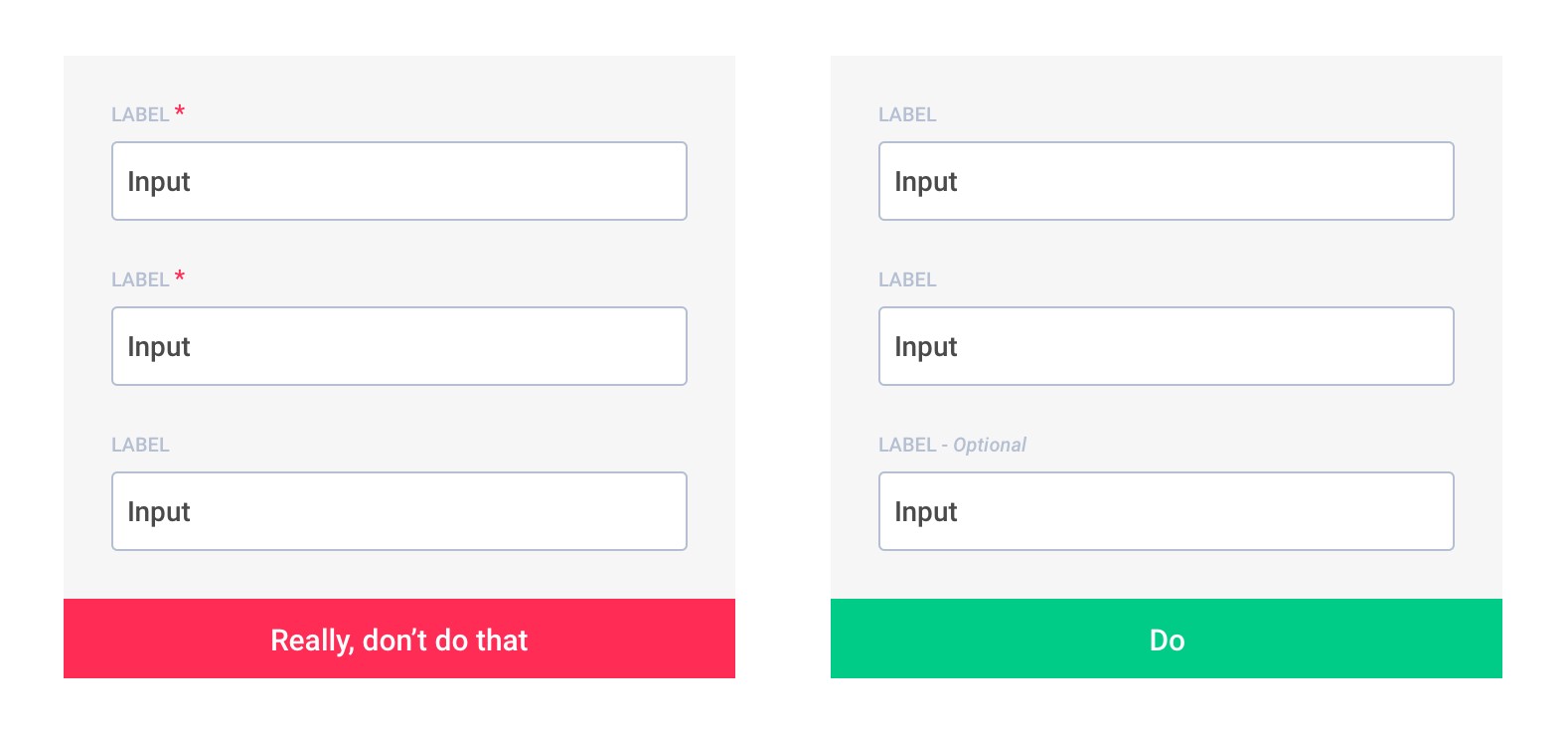
Why use optional fields is always better than required :
- An asterisk is obvious to you, not to everyone, believe me, there are always some who do not understand
- There are always more fields required than optional
- Less visual noise on your form makes it more readable and therefore faster to complete
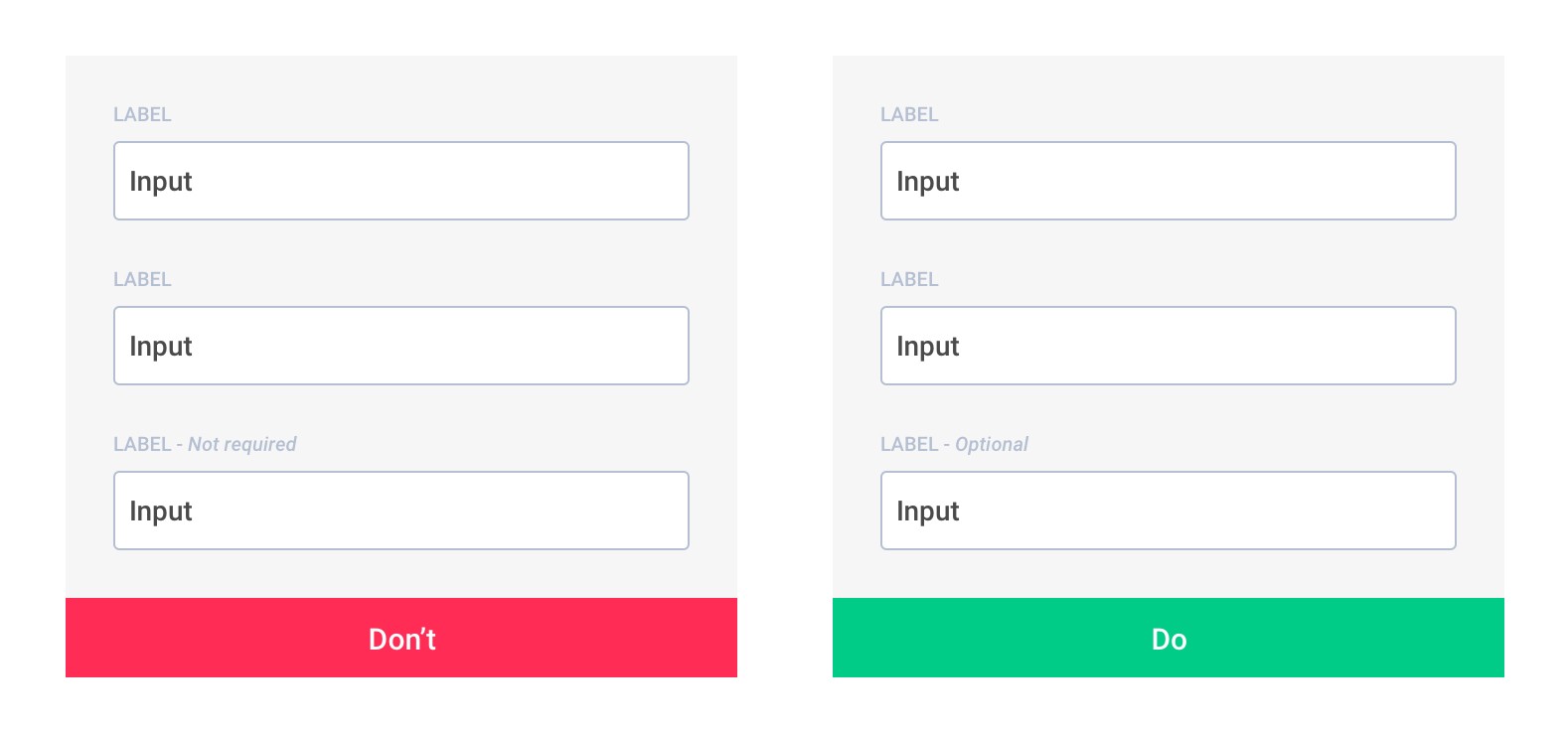
# Not required vs Optional
So let’s make it simple, in all cases, negations are less understandable.
# The end
You and me do not like the forms that look like toilet paper.
This point is the most critical, because as a designer or developer, it often happens that the demand for your form comes from the stackholder, from your product manager, well, whatever.
Yes, there are exceptions, sometimes you have to make a form with 40 fields : 20 required, 20 optional.
What to do in this situation?
Find the courage to question some things, stop telling you it’s normal, because everyone is doing it. There is often an infinite number of ways to collect the same information, in different ways, at a different time.
The only way to collect information about the user is to be transparent and thoughtful : don’t ask users to provide useless information. If you have too many optional fields, it’s bad, and you know it.
If you want to go deeper in the subject, I realize a small selection of sources and discussion on this subject :
- https://ux.stackexchange.com/questions/50584/mark-or-dont-mark-required-fields-if-all-are-required (opens new window)
- http://preibusch.de/publications/Preibusch-Krol-Beresford__voluntary_over-disclosure.pdf (opens new window)
原文: https://uxdesign.cc/form-field-required-vs-optional-9b4d7cdbf400 (opens new window)
——《论语》